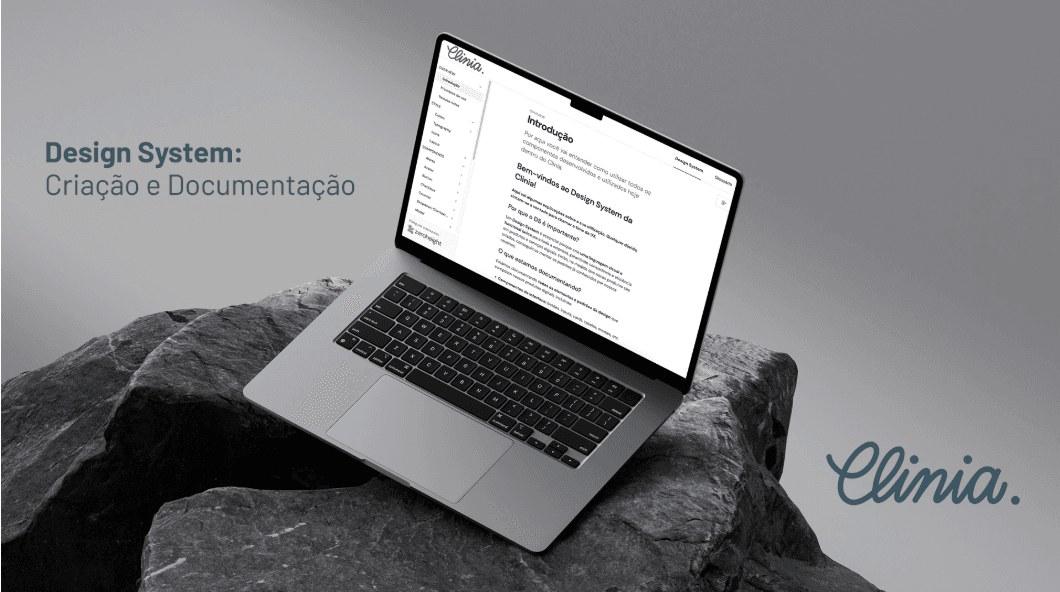
Design System — Clinia
Creating and documenting Clinia's Design System: a visual and technical foundation to ensure consistency, scalability and a shared language between design and development.
- Company
- Clinia
- Duration
- 1 year and 2 months (ongoing)
- Tools
- Figma · ZeroHeight
- Role
- UX Designer responsible for creating, building and documenting the Design System
- Skills
- Prototyping · Design concept · UX Design · Design System
About the project
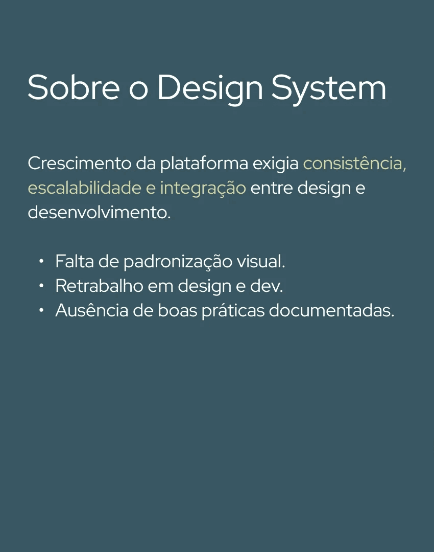
Clinia's Design System was born out of the need to support the platform's growth, bringing consistency, scalability and integration between design and development. It's an ongoing project I've been building and evolving for over a year.
Initial context
As the platform grew, a few gaps became clear: a lack of visual standardization across screens, constant rework between design and development, and no documented best practices — all of which made every new feature slower and more prone to inconsistency.
Project goals
Visual and technical consistency. Standardize components, colors, typography and behaviors, reducing rework and divergence across screens.
Clear communication between design and dev. Create a shared language and reduce ambiguity, speeding up handoff and raising delivery quality.
Accessible, practical documentation. Centralize best practices, guidelines and usage examples in an easy-to-reference repository, opening access to every team.
A scalable foundation. Structure the system to support continuous evolution, future integrations and new flows without losing cohesion.
Inspiration and references
Tailwind CSS. Served as a reference for building the design-token foundation — colors, typography, spacing and borders — bringing practicality and clarity to how styles are applied.
Material Design + Ant Design. Used as guides for thinking about componentization, layer hierarchy and scalability, helping structure solid, consistent patterns.
Methodology: Atomic Design
Atoms. Basic elements like colors, typography, buttons and icons — Brad Frost's methodology brought clarity, modularity and scalability, making it possible to build consistently from detail to whole.
Molecules. Simple combinations of atoms, like a form field with a label and input.
Organisms. More complex blocks made of molecules, like a header with a logo, search and navigation menu.
Building and documenting
Tokenization. The system's foundation went through standardizing color, typography, spacing, border and shadow variables, ensuring visual consistency and making maintenance easier in code.
Building in Figma
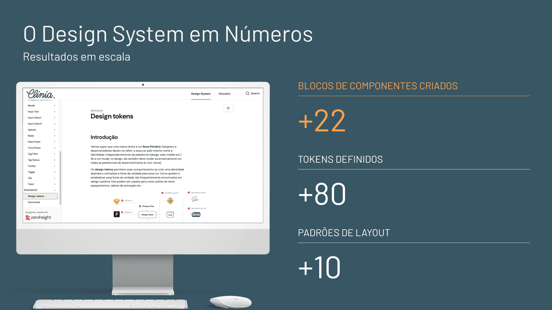
I organized the file with a clear hierarchy in Figma, with pages separated by level — Tokens, Components and Patterns — which makes the system easier to maintain and scale. So far the library holds more than 22 documented component blocks, from inputs and buttons to tooltips, tags and date/time patterns.
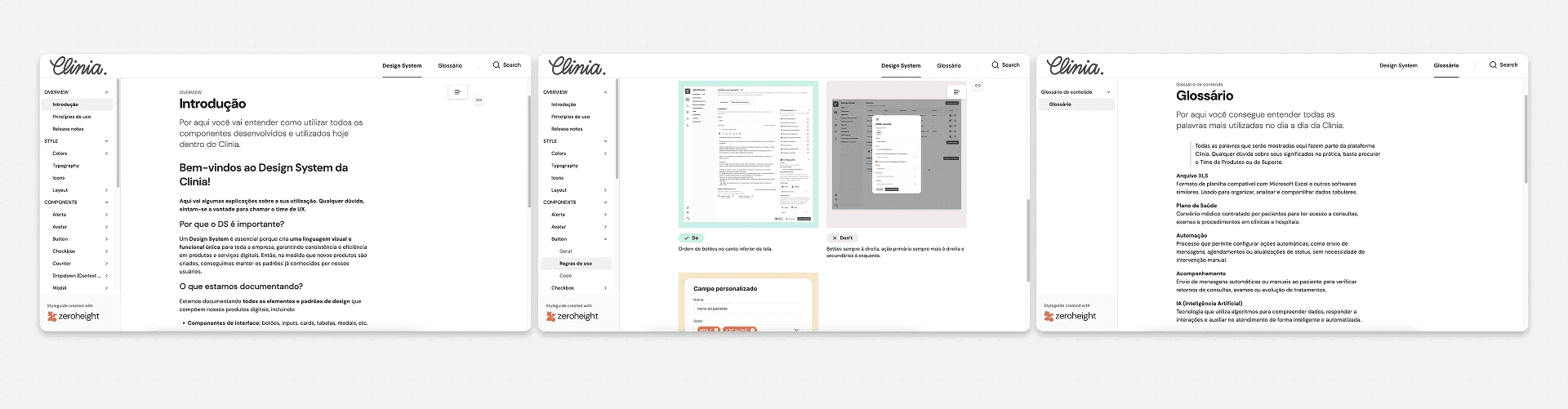
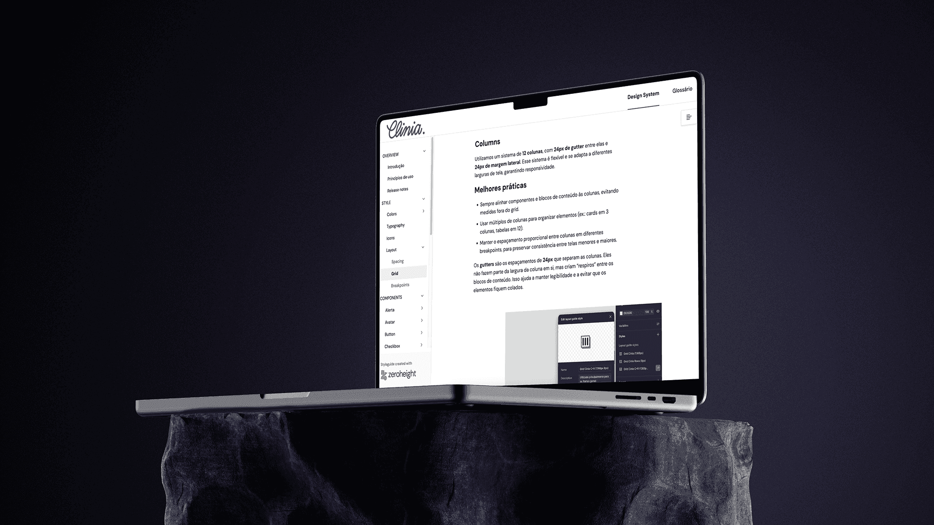
Documentation on ZeroHeight
Clear usage rules. To avoid inconsistency in how components are applied.
Plain-language explanations. Of each variable — colors, typography, spacing — for easy day-to-day reference.
Best practices. To standardize interactions and components between design and development.
Glossary. With the terms used in day-to-day work, bringing the two areas' language closer together.
Impact on Design
Less time spent building screens. Ready, documented components speed up day-to-day work.
Fewer doubts and misalignments between designers. Centralized documentation removes ambiguity about which pattern to use.
Greater visual consistency across every flow. Shared tokens and components keep the whole platform coherent.
Impact on Development
Tokens wired to Tailwind. Less manual CSS work, since design values become variables that apply directly in code.
Fewer interface bugs. Less drift between what was designed and what was shipped, in color, spacing and typography.
Faster delivery of new features. Already-documented components cut development and review time.
Impact on Clinia
Fewer support tickets. Related to visual and behavioral inconsistencies.
Scalability. New products and flows get built faster, with less design effort starting from zero.
Clearer communication between teams. Which translates into less rework between design, development and product.
22+
documented component blocks
80+
design tokens
10+
documented layout patterns
Learnings
Documentation is key. Creating isn't enough — you have to teach people to use it. A Design System only creates value once teams know where to find each pattern and how to apply it.
Technical alignment. A Design System only truly works once it's wired to real code, not just the design file.
A living product. More than a finished project, a Design System needs to be maintained, evolved and revisited whenever necessary.
Prioritize impact. The most efficient path starts with what delivers the most immediate value — typography, color, buttons — before moving on to more complex patterns.
“The Design System isn't a finished project — it's a living organism that grows alongside the product and the people who use it.”
Conclusion
Clinia's Design System has grown from a component library into the foundation that connects design and development in the team's day-to-day work. With more than 22 component blocks, 80 tokens and 10 layout patterns documented, the system already reduces rework, speeds up delivery and raises consistency across the whole platform — and keeps evolving, like a living organism, alongside the product and the people who use it.