
Design System | Bem Promotora
Bem Promotora's Design System was structured to centralize components, visual patterns and usage guidelines, promoting consistency across the company's digital products and making design-development collaboration easier.
- Delivered
- 2022
- Duration
- 3+ years (ongoing)
- Products in use
- 20+
- Industry
- Financial services
- Format
- Design System
Bem Design System
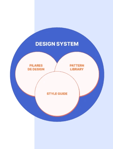
What is a Design System? A Design System is a repository of components, patterns and guidelines that guides the creation and development of digital products.
It works as living documentation, bringing together reusable components, styles, semantic patterns and properties that make communication between teams easier. Its goal is to establish a shared reference for decisions about new features, interfaces and product evolution.
Results
Rolling out the Bem Design System consolidated a shared base of components, visual patterns and guidelines for Bem Promotora's digital products. The initiative helped standardize interfaces, reuse components and integrate design and development, establishing a more consistent, scalable structure for the products' evolution.
43
different components built
20+
products using the design system
Process
From defining principles to implementation. Building the Design System was organized into four complementary stages: Discovery, Design, Development and Documentation.
Discovery. Understanding the brand, the organization's values and the needs of the people involved, also weighing in existing products and how standardization would affect their interfaces.
Design
Turning principles into reusable components. Once the context and the needs of designers, stakeholders and users were understood, the Design stage focused on defining the system's pillars, principles and goals.
This is where the Style Guide and component library were organized, using Figma as the central tool for structuring visual elements and their variations. Figma — Component library: the library brings together standardized components, like icons and buttons, organized for easy reuse and visual consistency across products.
Development
Connecting design and code. The development stage involves aligning with the technical team to turn the designed components into coded, reusable elements.
That integration makes it possible to define properties, behaviors and technical concerns, ensuring the Design System is applied consistently. Storybook — Coded component library: Storybook centralizes the built components, making it possible to see their variations, properties and behaviors in a shared environment.
Documentation
Accessible, centralized knowledge. The documentation brings together the guidelines designers, developers and other professionals need to use the Design System correctly.
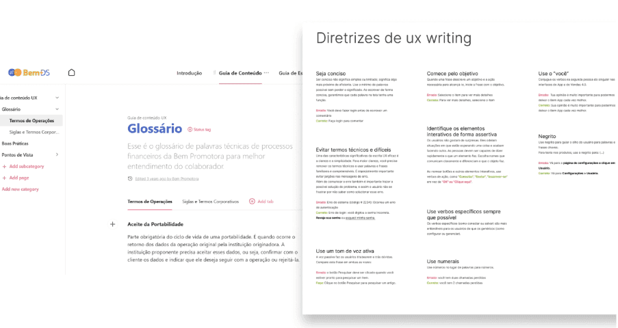
The goal is to offer, in one place, guidance on best practices, applications, variations and constraints for each component. Zeroheight — Component documentation: Zeroheight was used to centralize specifications, usage guidelines and visual references for the Bem Design System's components.
Benefits of the Design System
Centralizing components and styles makes it possible to build interfaces faster and more consistently, reducing the need to rebuild solutions that already exist.
Reusing patterns also helps minimize inconsistency and rework, while strengthening the products' visual identity.
With a shared library, teams can focus more attention on business rules, interface behavior and evolving the user experience.
Application and reach
One system shared across different products. The Bem Design System is used across different Bem Promotora platforms, keeping a consistent visual language between web and mobile products.
Among the applications it covers are BemWeb, BemApp, BemSign and the end-customer platform.